Caption Background vs Outline vs Shadow: Which Is More Readable
Caption background, text outline, and drop shadow compared for readability. W3C contrast standards, real-world video performance, and when to use each.

Background box is the most readable caption treatment. Text outline is second. Drop shadow is third. This ranking holds across W3C accessibility research, broadcast industry guidelines (Netflix, BBC), and real-world performance on variable video backgrounds. The tradeoff: background boxes cover more of the frame; outlines are a strong middle ground; shadows are the least reliable on light or variable backgrounds.
This guide explains why each treatment performs differently and when to use each.
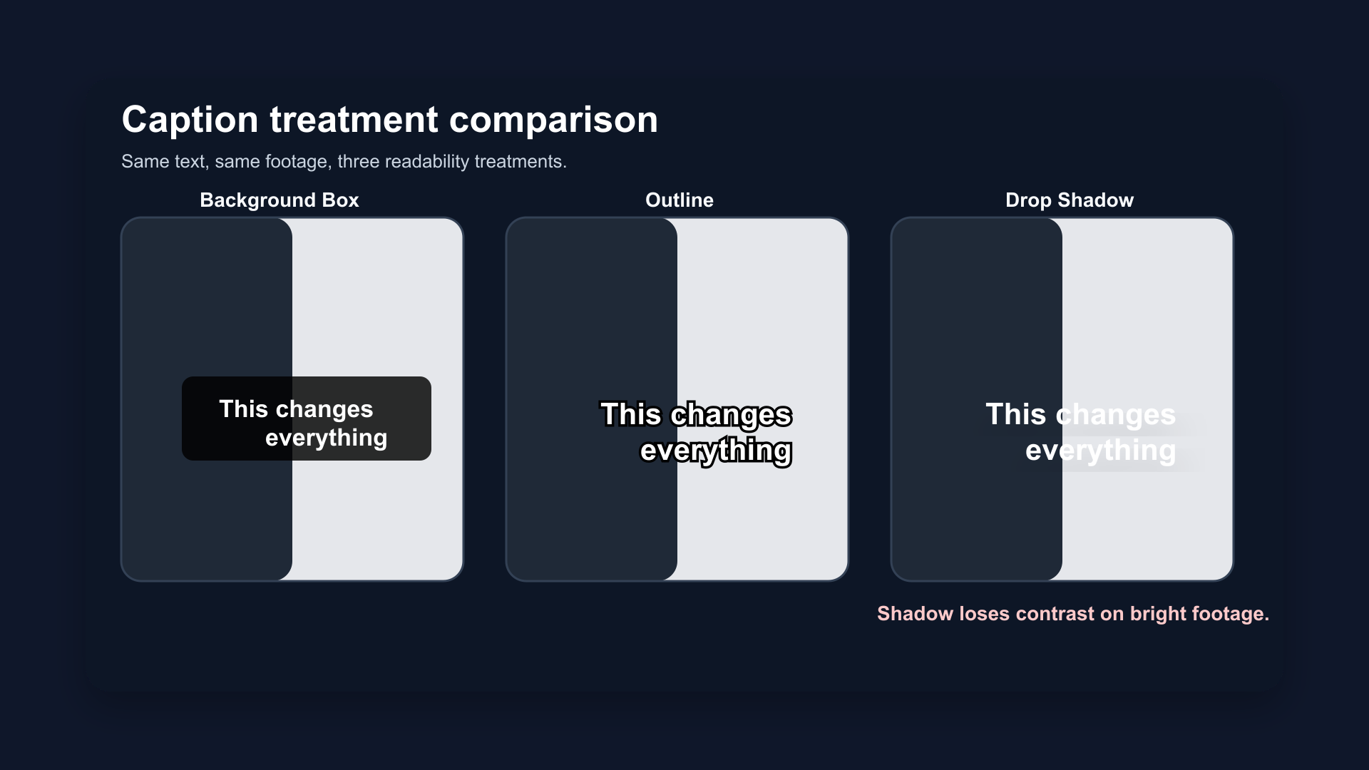
Same caption, same font, three treatments on a mixed-background video frame. Background box (top) maintains contrast regardless of what's behind it. Outline (middle) holds on most backgrounds. Shadow (bottom) fails on the light sky region.
The Core Problem: Video Backgrounds Change
Static documents have fixed backgrounds. You choose a text color and the contrast is predictable.
Video doesn't. A single caption can sit over:
- A dark jacket
- A white wall
- A window with bright light behind the speaker
- A transition between two scenes
- A moving background with rapidly changing luminance
Any caption treatment that depends on the background being consistently dark or consistently light will fail at some point during playback. The question is which treatment fails least.
1. Background Box (Solid or Semi-Transparent)
A solid or semi-transparent color block placed behind the caption text. The text sits on its own controlled background, independent of the video.
How it works: The box creates a guaranteed contrast surface. White text on a black background box achieves a contrast ratio of 21:1 — far exceeding the W3C WCAG AA standard of 4.5:1 and the AAA standard of 7:1.
Why it's most readable:
- Contrast doesn't depend on the video behind it
- Works on any background, any scene, any lighting condition
- Standard in broadcast television (BBC, Netflix, all major streaming services)
- Most accessible for viewers with low vision
Tradeoffs:
- Covers more of the frame — a horizontal band across the center or bottom obscures background details
- Can feel heavy on aesthetic or visual-heavy content
- The "TV subtitles" look is less popular on social media than on streaming platforms
When to use it:
- Content where accessibility is the priority
- Complex backgrounds that change frequently
- Any content going to audiences with accessibility needs
- Long-form content embedded in web pages
Semi-transparent variation: A 70–80% opacity black background box reduces visual intrusiveness while maintaining most of the contrast benefit. This is common on streaming platforms as a middle ground.
2. Text Outline / Stroke
A thin border drawn around each letterform, typically 1–4 pixels wide in a contrasting color (usually black outline on white text, or white outline on dark text).
How it works: The outline separates the text letterforms from the background by adding a visible edge at every point where text meets video. Even when the background changes, the outline maintains a thin but consistent contrast boundary.
WCAG performance: Text outline alone may not guarantee 4.5:1 contrast ratio at all points — it depends on outline width and background variation. A 3–4px black outline on white text achieves near-reliable contrast on most backgrounds. On very bright or white backgrounds, it can fall short.
Why it's the social media standard:
- Less visually intrusive than a background box
- Reads cleanly on the majority of video backgrounds
- Matches the aesthetic of caption styles on TikTok, Reels, and Shorts
- Works at the standard 7–10% frame height caption sizes
Tradeoffs:
- Can fail on extreme backgrounds (white walls, bright windows)
- Thin outlines (1–2px) are less reliable than 3–4px
- Not sufficient on its own for WCAG AAA compliance in all scenarios
When to use it:
- Social media content (Shorts, Reels, TikTok)
- Talking-head content with mostly neutral backgrounds
- Any situation where visual cleanliness matters
Best practice: 3–4px black stroke on white text, combined with a light drop shadow. This two-layer treatment covers more edge cases than outline alone.
3. Drop Shadow
A soft or hard shadow cast behind the text, giving the letters visual separation from the background.
How it works: The shadow creates a halo of lower luminance behind each letterform. On dark backgrounds, white text with a dark shadow reads clearly. On light backgrounds, the shadow becomes invisible and the text loses contrast.
The failure mode: Drop shadow depends entirely on the video background being darker than the shadow. On white walls, bright windows, outdoor sky, or any light background, drop shadow fails. The shadow color and the background color merge, and the white text becomes white-on-white.
WCAG note: W3C accessibility guidelines explicitly state that drop shadow alone does not meet contrast requirements in most scenarios. Accessibility tools often fail to evaluate text-shadow correctly — but the real-world failure on light backgrounds is consistent and predictable.
When it works:
- Dark, consistent backgrounds (dark studios, night footage)
- As a supplemental layer under an outline (outline handles contrast, shadow adds depth)
- Low-stakes aesthetic enhancement on controlled content
When it fails:
- Outdoor content
- Talking head against a window
- Any video with variable lighting or background
- Bright product shots
Bottom line: Use drop shadow as a supplement to outline, not as a standalone treatment. Never rely on shadow alone for caption readability.
Side-by-Side: W3C Contrast Standards
The W3C Web Content Accessibility Guidelines (WCAG) define contrast ratios for readable text:
| Standard | Contrast Ratio | For Captions |
|---|---|---|
| WCAG AA | 4.5:1 (normal text) | Minimum for accessibility compliance |
| WCAG AAA | 7:1 (normal text) | Enhanced accessibility |
| White on black box | 21:1 | Exceeds AAA — always sufficient |
| White + 4px black stroke | ~12:1 on average backgrounds | Meets AAA on most surfaces |
| White + drop shadow only | Variable (3:1–20:1) | Unreliable — fails on light backgrounds |
W3C explicitly states that text shadow is insufficient as a standalone contrast solution. Background boxes and solid outlines are the reliable approaches for accessibility-compliant captions.
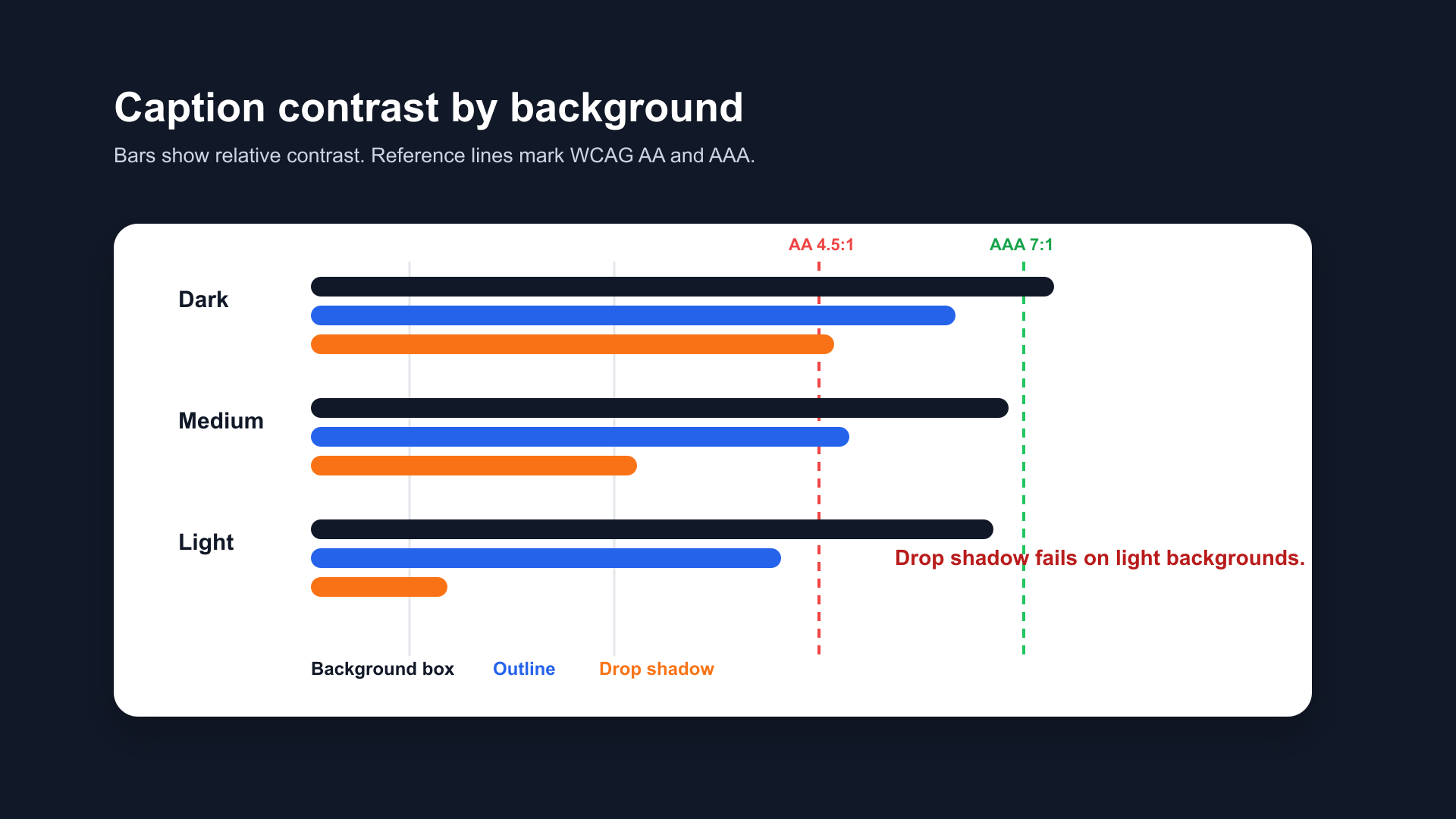
Contrast ratio comparison across three caption treatments. Background box exceeds WCAG AAA in all conditions. Outline meets AA–AAA on most backgrounds. Drop shadow alone falls below AA on light backgrounds.
Broadcast Industry Standards
Professional captioning guidelines from Netflix, BBC, and broadcast standards bodies consistently choose background box as the default treatment:
Netflix Timed Text Style Guide:
- Default: white text on a semi-transparent black background
- Maximum 42 characters per line
- Minimum contrast ratio maintained at all times
BBC Subtitle Guidelines:
- Standard subtitle font at 8% of frame height
- Background box (known as "drop shadow box" in BBC terminology) as default
- Outline treatment acceptable as secondary option
Why broadcast uses background box: Television is watched in variable lighting conditions — in dark rooms, in bright rooms, with reflections on screens. The background box is the only treatment that maintains readability regardless of viewing conditions. The same logic applies to video captions on phones in variable outdoor environments.
What to Use on Social Media vs Streaming
| Context | Recommended Treatment | Why |
|---|---|---|
| Instagram Reels, TikTok, Shorts | Outline (3–4px) + optional shadow | Visual cleanliness, fits platform aesthetic |
| YouTube long-form | Background box or outline | Longer watch time, more background variation |
| Streaming / VOD | Background box | Broadcast standard, accessibility compliance |
| Accessibility-first content | Background box | Guaranteed contrast in all conditions |
| Aesthetic / visual-heavy content | Outline or light background (70% opacity) | Least intrusive while maintaining readability |
How BlitzCut Handles Caption Treatments
BlitzCut ships with pre-built caption styles that use outline and background treatments optimized for short-form social video — bold white text with a black stroke, pre-sized at 7–9% frame height, positioned in the platform safe zone.
The outline treatment is the default because it balances readability and visual cleanliness for the majority of talking-head content.
Frequently Asked Questions
Is background box or outline better for captions?
Background box is more readable and more accessible. Outline is less visually intrusive and more common on social media. For accessibility-critical content: background box. For social video: outline (3–4px stroke) with optional shadow.
Does drop shadow count as accessible captioning?
No. W3C WCAG guidelines state that drop shadow alone does not meet contrast requirements. Shadow is unreliable on light or variable video backgrounds. Use outline or background box as the primary treatment.
What contrast ratio do captions need?
WCAG AA requires 4.5:1 contrast ratio for normal text. WCAG AAA requires 7:1. White text on a solid black background box achieves 21:1. A 4px black outline on white text achieves approximately 12:1 on most backgrounds. Drop shadow alone is variable and often below the 4.5:1 threshold on light backgrounds.
What do Netflix and BBC use for captions?
Both Netflix and BBC default to white text on a semi-transparent black background box. This is the broadcast industry standard because it maintains contrast in all viewing conditions.
Can I combine outline and shadow?
Yes — and it's often the best approach for social video. Outline handles the contrast requirement; shadow adds depth and slightly improves readability on medium backgrounds. Use outline as the primary treatment and shadow as a secondary layer.
Related Guides
- Best Caption Font for Instagram Reels (2026) — font selection guide
- Best Caption Style for YouTube Shorts (2026) — Shorts style guide
- How to Make Captions Look Professional — complete style guide
- Best Caption Colors for TikTok — color strategy
- Safe Zone Guide for YouTube Shorts, Reels & TikTok — positioning
Post every day without spending hours editing
BlitzCut is a native App Store app for iPhone, iPad and on Mac. Get from raw footage to TikTok-ready in under 2 minutes, so editing is never the reason you didn't post.
Download BlitzCut on the App StoreRelated Articles
Keep Reading

Does CapCut Work on Mac? (2026 Guide + Alternatives That Work Better)
CapCut has a Mac desktop app in 2026, but with real limitations. Here's what works, what doesn't, and the Mac-native alternatives creators are using instead.

Instagram Edits App 2026: What It Is for Reels Creators
Instagram Edits is Meta's standalone video editor for Reels creators. See how it compares to CapCut and BlitzCut, and whether it's worth using in 2026.

How to Post Every Day Without Burning Out (2026 Creator Workflow)
Most creators burn out because they lack a system, not willpower. Batch recording and AI editing let you post daily without it becoming a second job.