TikTok Caption Trends 2026
TikTok caption trends in 2026: Hormozi style is saturated, Dynamic Minimalism is the new meta, TikTok Sans is rising. What's in, what's out, what's next.

TikTok caption trends move faster than most creators realize. The style that was fresh and high-performing in 2022 can feel visually stale by 2024 and invisible by 2026 — not because the technique stopped working mechanically, but because saturation removes the differentiation it once created.
In 2026, the dominant caption style from the last three years — the Hormozi bold-yellow package — has hit saturation. The community has identified a successor: Dynamic Minimalism. Several new styles are rising. And TikTok itself introduced a new open-source font that is beginning to appear in creator content.
This article covers exactly where caption trends stand in 2026: what is performing, what is overused, and where the next differentiation opportunity is.
The 2026 Caption Format Landscape
The Baseline That Doesn't Change
Word-by-word (karaoke) captions — each word appearing in sync with speech, 2–3 words at a time — have graduated from trend to table stakes. Static full-sentence subtitle blocks now read as outdated or low-effort across most short-form content. If you are still using static sentence blocks for your primary caption format, you are starting from behind the current baseline.
This is not a trend in the emerging sense; it is the settled standard. The trends worth tracking are the variations within the word-by-word category.
What's In: Rising Styles for 2026
1. Dynamic Minimalism — The New Meta
Dynamic Minimalism is the successor to the Hormozi package and is now identified by multiple creator industry sources as the "new meta" for 2026.
What it is: Word-by-word sync mechanics (kept), tight editing rhythm (kept), heavy font (kept) — but with the noise removed. No flashing keyword colors. No sound effects on word entry. No emoji interspersed in subtitle lines. No multiple accent colors in the same caption line.
What it looks like: White bold text, black outline, word-by-word timing, subtle scale or fade animation on word entry. Clean. Nothing decorative.
Why it works now: Hormozi saturation means the full yellow-highlight package no longer differentiates. It signals "I am using the same template as everyone else." Dynamic Minimalism achieves the same mechanical advantages (word-by-word pacing, bold readability, mobile contrast) without the visual noise that reads as generic.
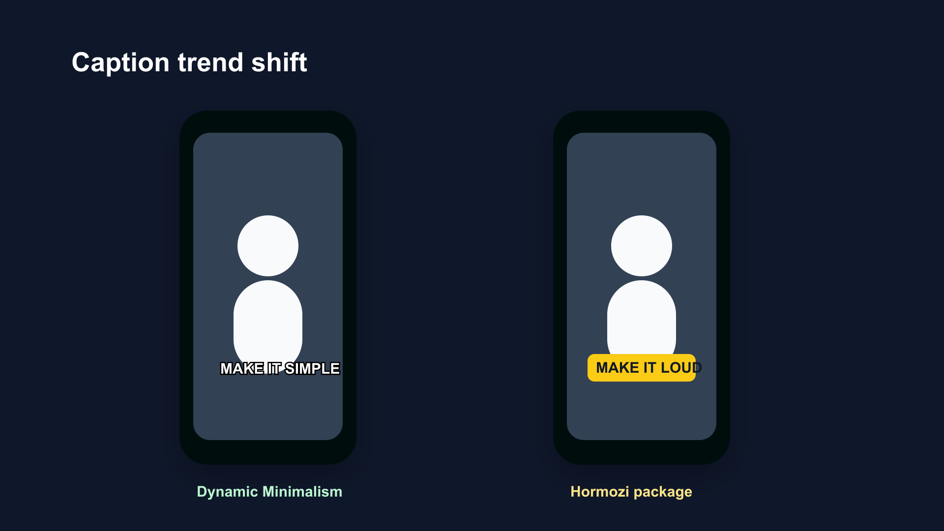
Dynamic Minimalism (left) vs the Hormozi package (right). Same word-by-word mechanics, same bold weight — without the yellow highlight and sound effects that now signal generic template usage rather than intentional design.
The format is particularly strong in creator niches that want to signal quality and authority — business, finance, personal development, professional education — where the Hormozi visual has become associated with low-differentiation content.
2. Colored Pill / Chip Backgrounds
Individual words or short phrases sit inside a solid-colored rounded rectangle (pill or chip shape). The background color provides contrast directly — no outline required — and creates a defined visual element that separates the caption from the background footage.
Colors in use: Black pills (clean, universal), white pills (works well on dark footage), yellow pills (warm, energetic), red pills (urgency), brand-color pills (for branded content).
CapCut now auto-applies pill backgrounds as a default preset in its AI caption output. This is pushing the format into mainstream usage across all creator tiers.
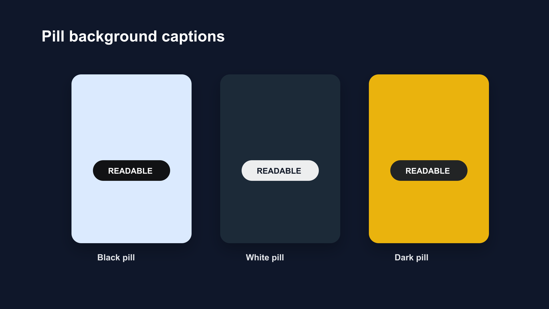
Pill backgrounds provide contrast regardless of what's behind them. Black pill on bright footage, white pill on dark footage — no outline or shadow tuning required per shot.
Why it's rising: The pill background solves the contrast problem structurally — it works on any background regardless of footage variation. For creators who shoot in multiple locations or mix dark and light footage, pill backgrounds eliminate the "captions disappear on this shot" problem.
3. Typewriter Character Reveal
Instead of whole words appearing at once, each word is revealed character by character — typewriter style. The reveal is timed to the speech, so the word fully appears by the time the speaker finishes saying it.
Where it works: Slower, more dramatic content. Narrated video essays. Educational content with a measured, deliberate tone. Content where the speaker wants to convey certainty or methodical thinking.
Where it doesn't work: Fast speech, energetic content, high-pacing editing. The character reveal is too slow for anything above approximately 140 words per minute.
4. Color-Switch Per Word
Each word in a caption sequence appears in a different color — or alternates between two colors per word. The effect creates visual rhythm and energy without requiring a highlight mechanism.
Best for: Music-adjacent content, rhythmic speech, high-energy short clips where visual pace should match audio pace.
Limit: Works for short clips (under 30 seconds). Becomes visually fatiguing over longer content.
5. "Quiet Aesthetic" / Lowercase Minimal
The counter-trend. Single-line lowercase captions in a thin or medium-weight serif or sans-serif, butter yellow or white, centered. No animation effects. Soft, calm, and intentional.
This style is tied to the "quiet luxury," "cozy lifestyle," and "soft aesthetic" trends dominating lifestyle, wellness, and personal brand content in 2026. It functions as a visual signal of the creator's aesthetic sensibility rather than as a pure readability tool.
Fonts in this style: Poppins Light, EB Garamond, DM Serif Display, sometimes Georgia.
What's Out: Overused and Declining Styles
The Full Hormozi Package — Saturated
The Hormozi caption system — Montserrat Black or Proxima Nova Bold, white ALL CAPS base, #f7c204 yellow keyword highlight, "woosh" sound effect on word entry, emoji between lines — has hit peak saturation.
Alex Hormozi himself reportedly stopped using it, which is itself widely discussed in creator communities as the signal that it has become too common to differentiate.
What has not changed: The underlying mechanics of word-by-word timing, bold font, and high contrast still perform. What has been rendered generic is the specific yellow highlight combined with woosh sounds and ALL CAPS. The system still works; the distinctive signaling it once created does not.
Creators who drop the yellow highlight and sound effects while keeping the bold word-by-word timing are effectively practicing Dynamic Minimalism.
Heavy Shake / Vibrate Effects on Every Word
The per-word shake effect — where each word vibrates or jiggles on entry — was popular in 2022–2023. It now reads as an overused template setting rather than a creative decision. Multiple creator guides cite it as the clearest marker of outdated caption work.
Static Full-Sentence Blocks
Sentence-level static subtitles read as low-effort in the current environment. They remain appropriate for accessibility compliance, long-form YouTube content, and dense technical content — but as the primary caption format for short-form social, they signal inattention to production quality.
Electric Blue and Neon Green as Primary Colors
Neon and electric palette choices dominated in 2022–2023, particularly in fitness and gaming content. In lifestyle and mainstream content niches, these colors now feel dated. They remain viable in specific subcultures (gaming, esports, specific music genres) where the aesthetic is intentional.
All-Caps with Three or More Colors Per Line
Using red, yellow, and white within the same caption line creates visual chaos rather than emphasis. The principle of one base color, one accent color holds in 2026. Multiple accent colors in a single caption are out.
Fonts in 2026: What Creators Are Using
| Font | Weight used | Niche | Notes |
|---|---|---|---|
| Montserrat Bold/Black | 700–900 | Business, education, general | Most widely used TikTok caption font |
| Bebas Neue | 700 (only weight) | Fitness, energy, sports | Condensed, all-caps only |
| Anton | 700 | General | Free alternative to Proxima Nova; Hormozi substitute |
| Archivo Black | 900 | Opinion, hype | Punchy, statement-making |
| Poppins | 400–700 | Lifestyle, wellness | Rounded, approachable |
| Inter | 400–600 | Tech, minimalist | Clean, neutral |
| Proxima Nova Bold | 700–800 | Premium content | Paid; used in Submagic/CapCut presets |
| TikTok Sans | 400–700 | Platform-native aesthetic | New in mid-2025; signals native fluency |
TikTok Sans is a new entry. TikTok/ByteDance released it as open-source in mid-2025. It is beginning to appear in creator content as a font choice that signals platform fluency — using the platform's own typography as an intentional design signal.
The overall font direction in 2026: bold weight (700–900), condensed or regular-width, sans-serif. Script fonts are out for primary caption use. Thin weights are out for any caption use.
Colors in 2026
Still dominant: White text with black outline — the universal baseline. Used in the majority of short-form content.
Active in business/education: Yellow (#f7c204) as a keyword highlight color. Not disappearing, but no longer differentiating on its own.
Rising: Butter yellow (#F5D76E) in lifestyle content — softer, warmer, associated with authenticity and inner-thought content.
Rising: Pill background colors (black, white, red, orange, yellow, brand-specific) as a structural approach to contrast.
Fading: Neon green and electric blue as primary or accent colors outside their native subcultures.
Stable in niche use: Red as a single-word emphasis accent in fitness and urgency content.
Platform Native vs. Third-Party Tool Usage
TikTok's native auto-caption system is used primarily by casual creators or for quick edits within TikTok's own editor. The native tool's style customization is limited — basic font choices, simple color selection, no karaoke/pill/Dynamic Minimalism presets.
The dominant creator workflow for mid-to-high-effort content in 2026:
- Record/edit in a dedicated tool (BlitzCut, CapCut, Submagic, Captions.ai)
- Caption with word-by-word animation in the editing tool
- Export the captioned video as a burned-in file
- Upload the finished file to TikTok
CapCut, as a ByteDance product (same parent as TikTok), functions as a semi-native tool — its AI caption presets are designed for TikTok distribution and its templates are built from TikTok-native aesthetic patterns. For creators who want the closest thing to a TikTok-native workflow with full animation capability, CapCut is the dominant choice.
Submagic leads in the high-volume professional and agency segment. BlitzCut leads for Mac creators who want silence removal integrated with captioning. Captions.ai leads in the iOS talking-head segment.
What to Expect in 2027
The directional signals from 2026 suggest:
Pill backgrounds will normalize. As CapCut makes them the default AI output, pill backgrounds will follow the same path as word-by-word sync — from trend to baseline. Expect the differentiation to shift to pill color choice and animation style.
TikTok Sans will grow. As more creators adopt the platform's open-source font, it will signal insider knowledge initially and become mainstream within 12–18 months.
Minimalism will consolidate. Dynamic Minimalism is a correction to over-designed captions. As the "quiet aesthetic" trend continues in lifestyle content, expect the minimal single-line lowercase format to spread beyond its current lifestyle niche.
AI-generated caption styling. As tools get better at auto-matching caption style to content energy (fast speech → larger/more dynamic captions, slow speech → minimal captions), the manual style decision may become a parameter adjustment rather than a full design choice.
Frequently Asked Questions
What caption style is trending on TikTok in 2026? Dynamic Minimalism — word-by-word timing, bold font, high contrast, without the yellow highlights, sound effects, or emoji of the Hormozi package. Colored pill backgrounds are also rising fast. The Hormozi style itself is still used but is considered saturated.
Is the Hormozi caption style still good in 2026? The mechanics are still effective: word-by-word timing, bold font, high contrast. The specific yellow highlight + woosh sounds combination is saturated — it no longer differentiates. Using the mechanics without the signature styling (Dynamic Minimalism) is the current evolution.
What is the best font for TikTok captions in 2026? Montserrat Bold/Black (most widely used), Anton (free alternative), Bebas Neue (fitness/energy niche), Poppins (lifestyle/wellness). TikTok Sans, released mid-2025, is a new entry signaling platform-native design awareness.
What does yellow text mean on TikTok?
Two distinct meanings: (1) the Hormozi-style bright yellow (#f7c204) on business/educational content signals authority and high-value information; (2) butter yellow on lifestyle content signals vulnerability, inner thoughts, or authenticity. Context determines which reading applies.
Are emoji in captions still popular on TikTok? Declining for inline emoji in subtitle lines — a practice associated with 2022 Hormozi-style content. Emoji as standalone sticker overlays remain common. Emoji within caption text is now a marker of outdated caption design.
What replaced the Hormozi caption style? Dynamic Minimalism: same word-by-word sync and bold readable font, without the yellow highlights, sound effects, multiple accent colors, or emoji. Clean, fast, no decoration.
Related: Best Caption Style for TikTok · Best Caption Colors for TikTok · Word-by-Word Captions vs Full-Sentence Captions
Post every day without spending hours editing
BlitzCut is a native App Store app for iPhone, iPad and on Mac. Get from raw footage to TikTok-ready in under 2 minutes, so editing is never the reason you didn't post.
Download BlitzCut on the App StoreRelated Articles
Keep Reading

Does CapCut Work on Mac? (2026 Guide + Alternatives That Work Better)
CapCut has a Mac desktop app in 2026, but with real limitations. Here's what works, what doesn't, and the Mac-native alternatives creators are using instead.

Instagram Edits App 2026: What It Is for Reels Creators
Instagram Edits is Meta's standalone video editor for Reels creators. See how it compares to CapCut and BlitzCut, and whether it's worth using in 2026.

How to Post Every Day Without Burning Out (2026 Creator Workflow)
Most creators burn out because they lack a system, not willpower. Batch recording and AI editing let you post daily without it becoming a second job.